


TL;DR
I designed a modern, responsive website for a computer education institute from the ground up. Since the client was planning on dominating the local market, I needed to do a deep-dive into the industry landscape, the companies' potential competitors and conduct interviews with users in the target demographic to understand the pain points and needs of potential customers.
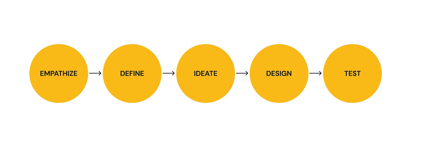
With those learnings in mind, I laid the groundwork for the website through developing the information architecture and analyzing potential user flows. I then created wireframes, rapid prototypes, conducted user testing, and finally created the user interface design and branding elements to position the company in a way that reflected its values.
Challenge
King's computer college offers computer training to individuals, businesses, institutions, and organizations. They offer both basic and advanced computer (IT) courses and issues certificates upon course completion.
My challenge was to create a responsive website with seamless navigation that reflects its values of accessibility, community, and thoughtfully-crated curriculum.
An additional challenge was designing a way for website visitors to sign up for a monthly subscription service for different courses, which would be featured on the responsive website and craft a flawless online payment experience.
Design process
Research
Research goals :
Discover industry best practices
Understand what is working and not working for kings computer college's competitors
Uncover users’ biggest motivations for enrolling in computer and IT training.
Discover users’ pain points when participating in other monthly training.
Competitive Analysis
In this computer age, every day brings another technological advancement. Technology is evolving every day and computer training programs and schools must meet the competition to keep current on industry trends.
It may get a little confusing when you want to take a computer training course in Lagos. In my research I discovered that finding the right training schools that are conducive for learning, and will properly guide you on the course you paid for is the most important thing potential customers look for.
When researching potential competitors in the Amukoko area, I found that there were no schools that were branding themselves in a similar way to the king's computer college (accessibility, community, and thoughtfully-crated curriculum).
I expanded my search to Surulere(New horizons, HIIT, NIIT, and Flamytech) where there are IT training institutes branding themselves in this way.
Takeaways
NIIT, HIIT, and New horizons seem to have the strongest branding with a focus on professionalism and expertise.
I went through the websites of 10 competitors and the majority of them seem to have bad Information Architecture and navigation.
Pricing seems to be a key indicator in the customer segment, High-end schools like NIIT, HIIT, and new horizons target the financially stable customer segment.
1.1 Interviews
Next, I set up two interviews with individuals in the target demographic(15-25-year-old teenagers and youths living in or near the city) to gain a better understanding of the users' motivations and pain points.
Overview of findings
Participants are willing to pay more if the quality of the training offered exceeds expectations.
Participants prefer installment payments to upfront payments(because of their socio-economic status)
Participants went for the evening class rather than the morning class (because of school and/or work constraints)
Define
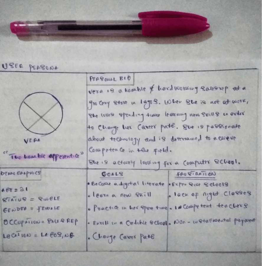
Personas
Based on the takeaways from my research, I created the ideal persona Chisom vera. Her goals, frustration, desired courses, and her best learning environment reflect the users I interviewed.
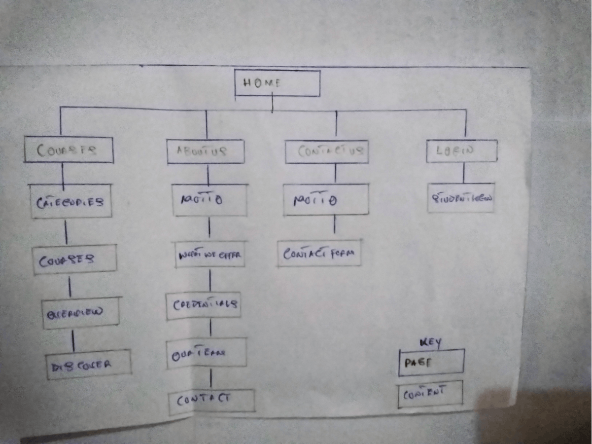
Information Architecture
Sitemap
Using the reviewed sites as an example with my user interviews in mind, I created a sitemap for the king's computer website. I wanted the information architecture to be intuitive and seamless.
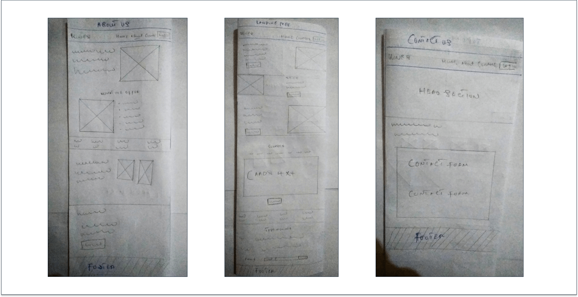
Wireframes
Sketching
To start the ideation process, I quickly sketched numerous versions of the website, I used my sitemap to help build out the low-fi sketch and kept in mind the users and their logical flow.
Below are the sketches for the few pages;
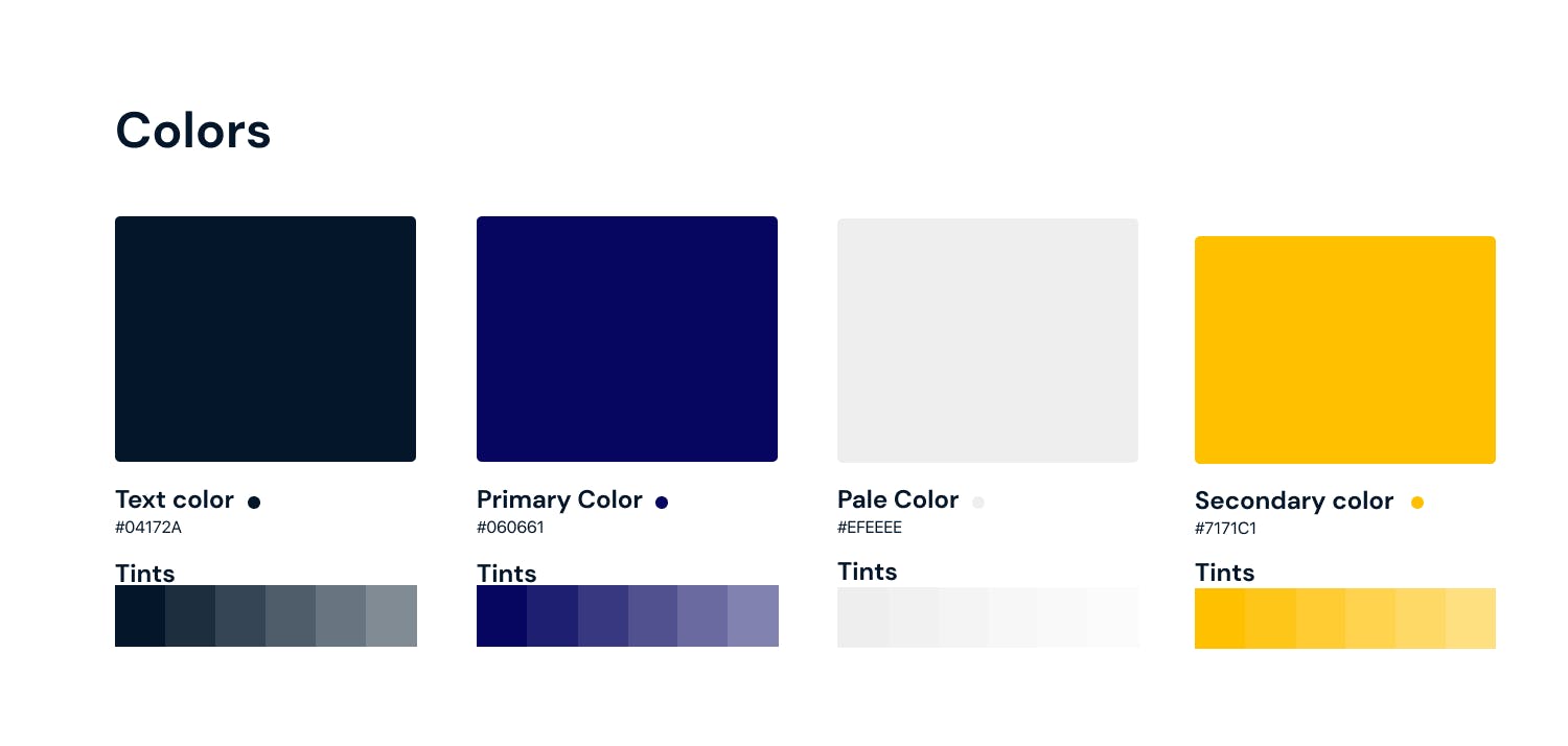
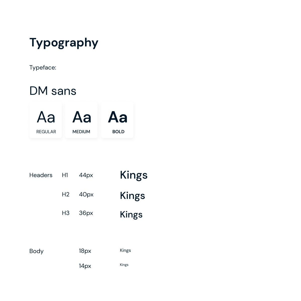
Style guide
When developing the style tile for Kings computers, I wanted to develop a subtle and cheerful mood so users would feel positive when using the website. For this reason, all design choices were all approachable and accessible.
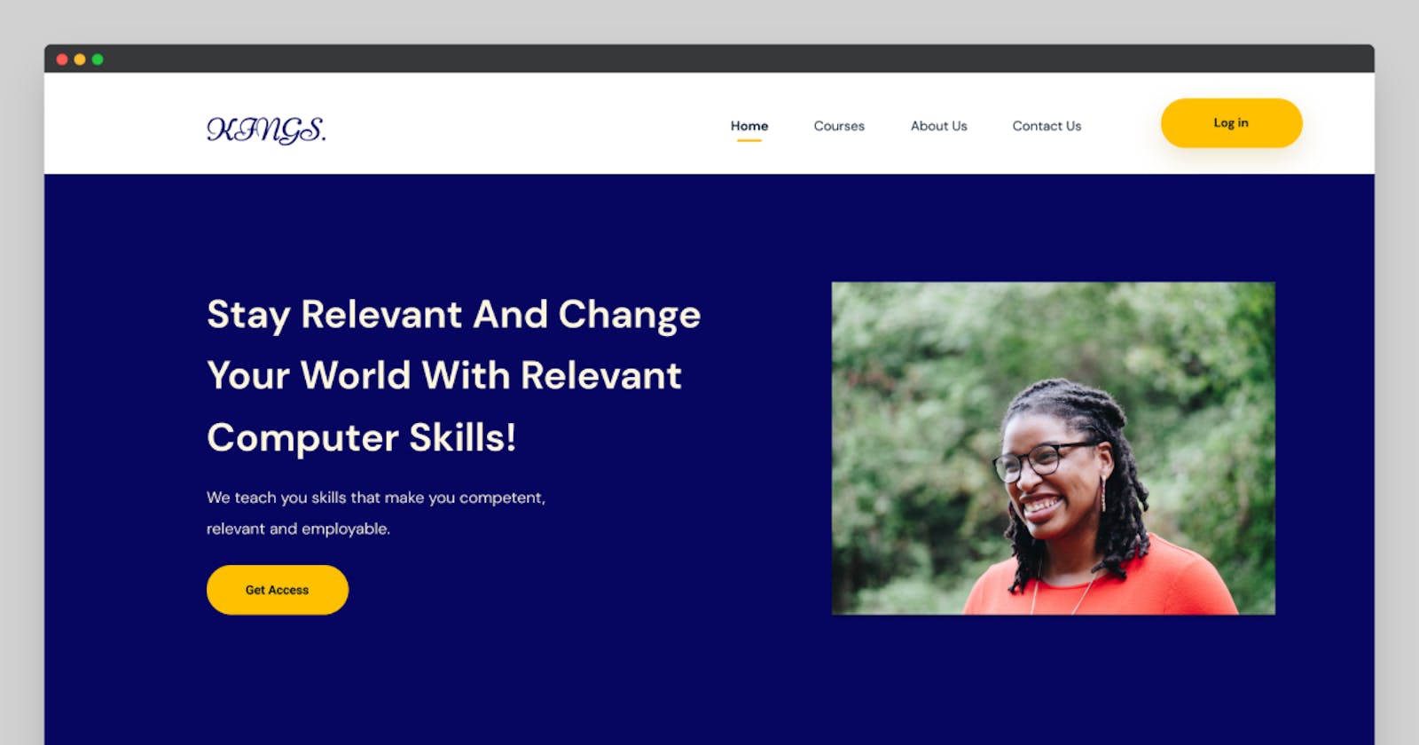
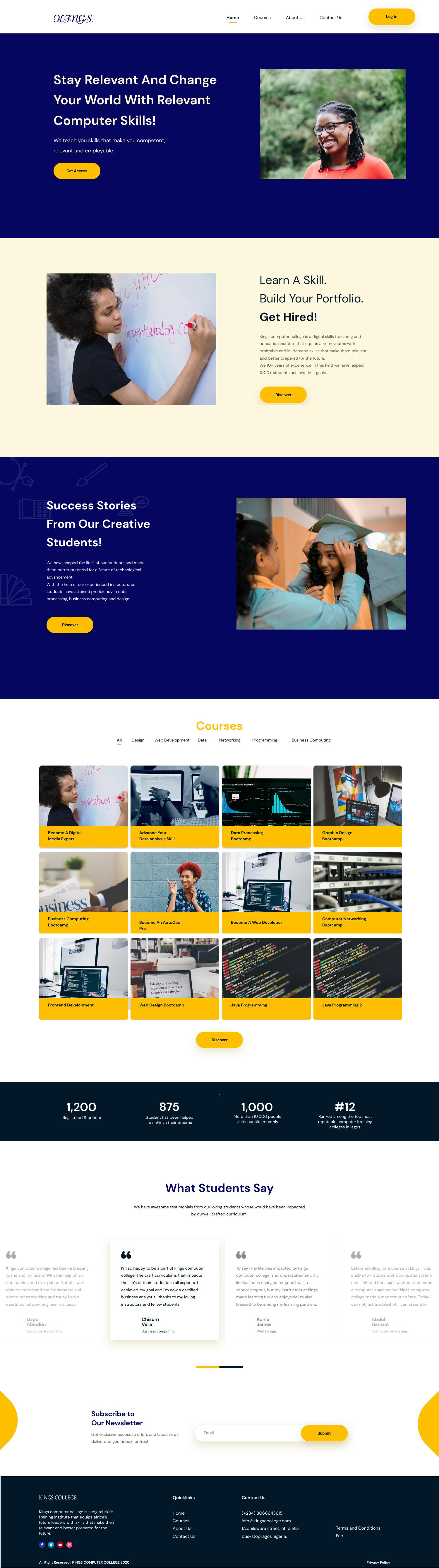
UI design
With my low-fi wireframe as a guide, I created a hi-fi redesign of the website in Figma;
Landing page
About
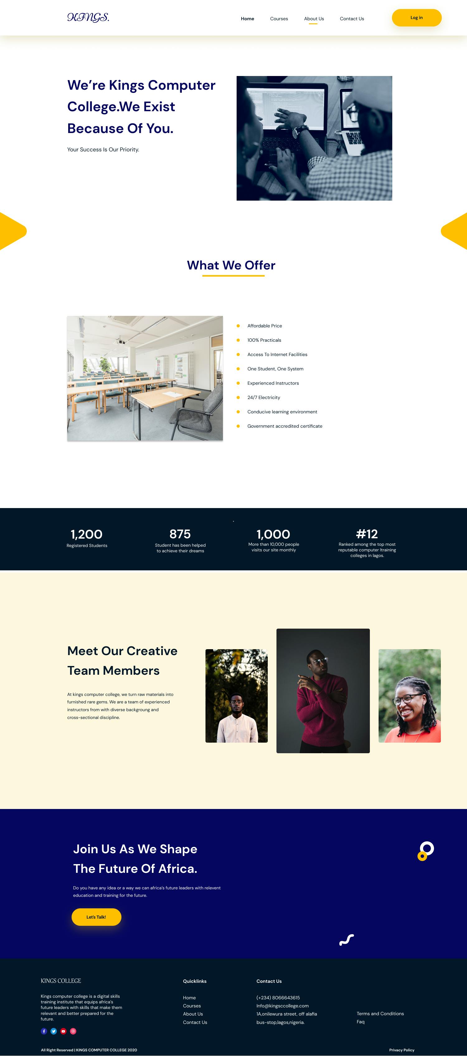
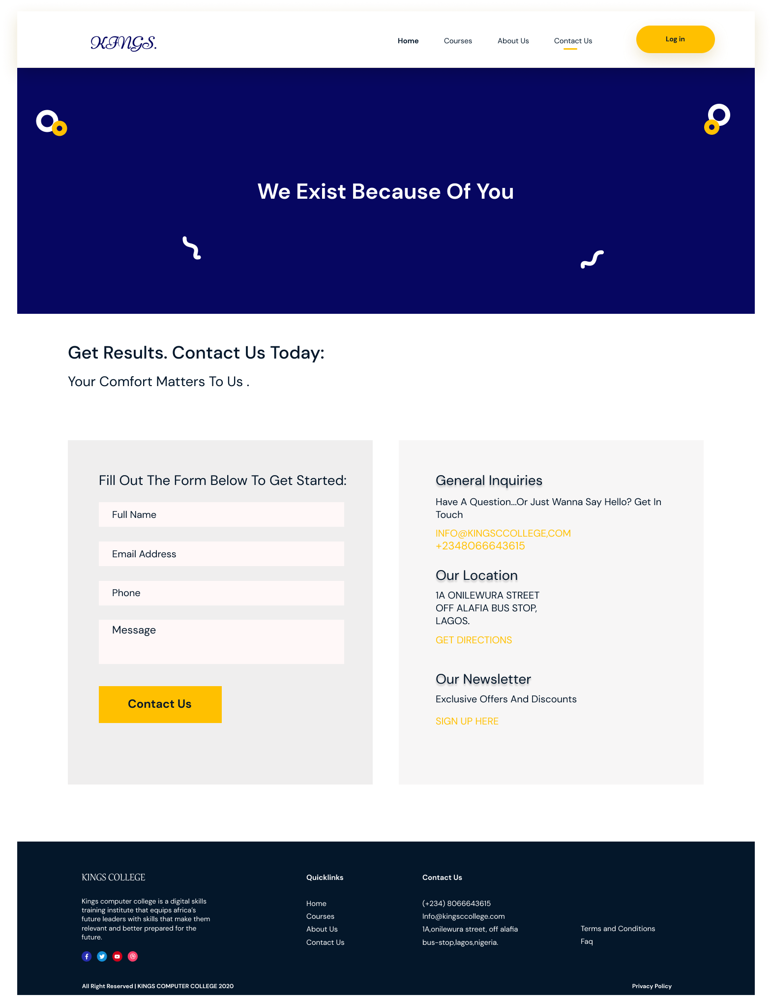
Contact us
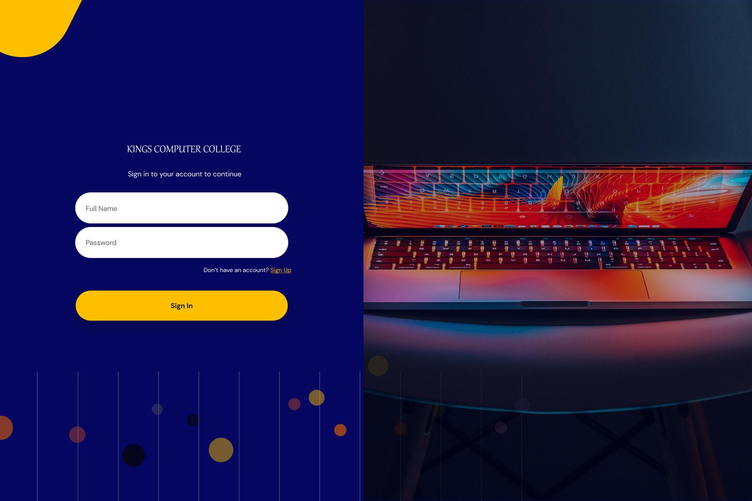
Access forms
Log in
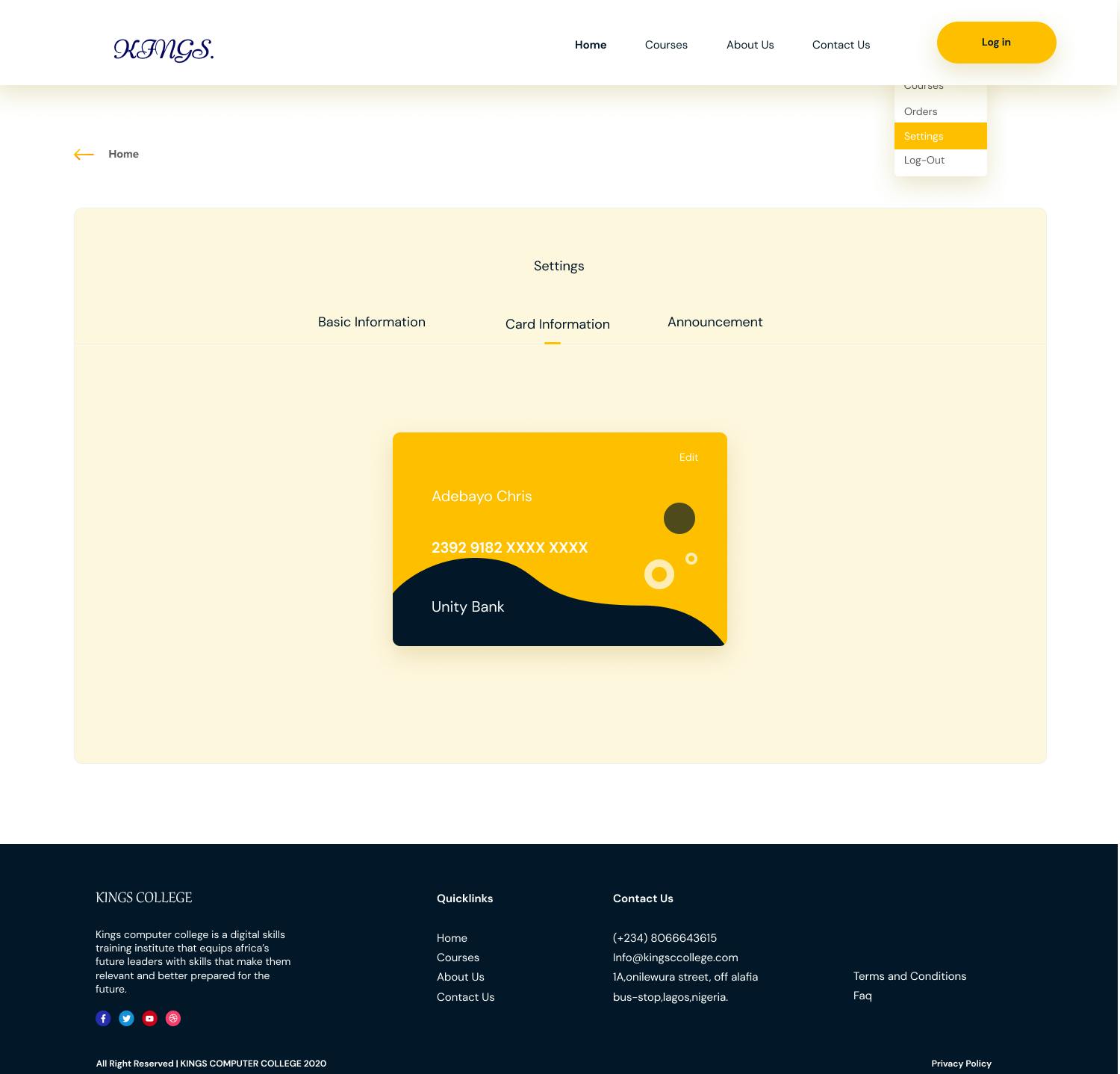
A snapshot of the dashboard
Dashboard
An additional challenge was designing a way for website visitors to sign up for a monthly subscription service for different courses, which would be featured on the responsive website and craft a flawless online payment experience.
Here is the task flow I crafted for the online course payment procedure
taskflow.jpg
After choosing a course, the user gets an overview of the course;
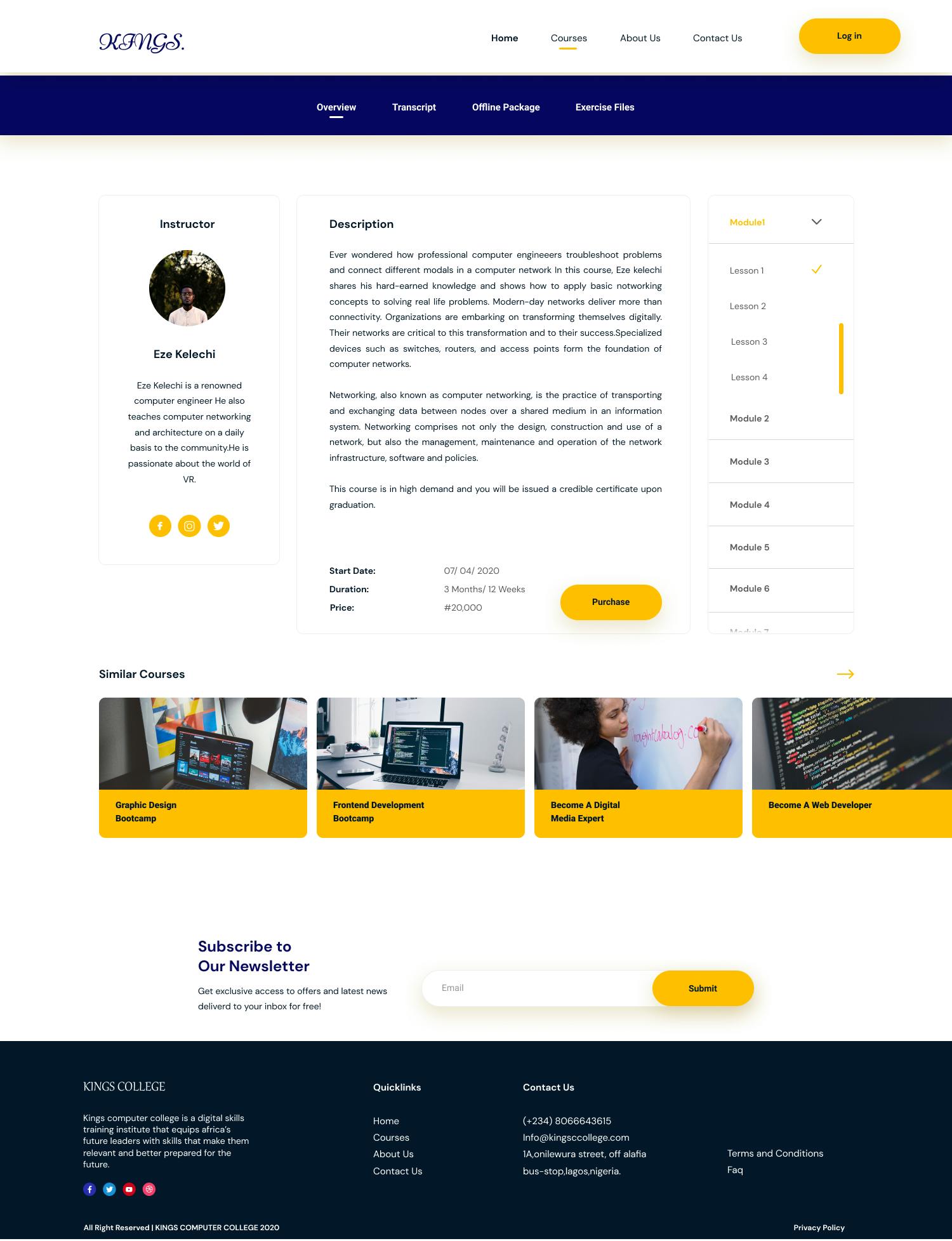
Once satisfied he clicks on the purchase button and proceeds to fill in his delivery information;
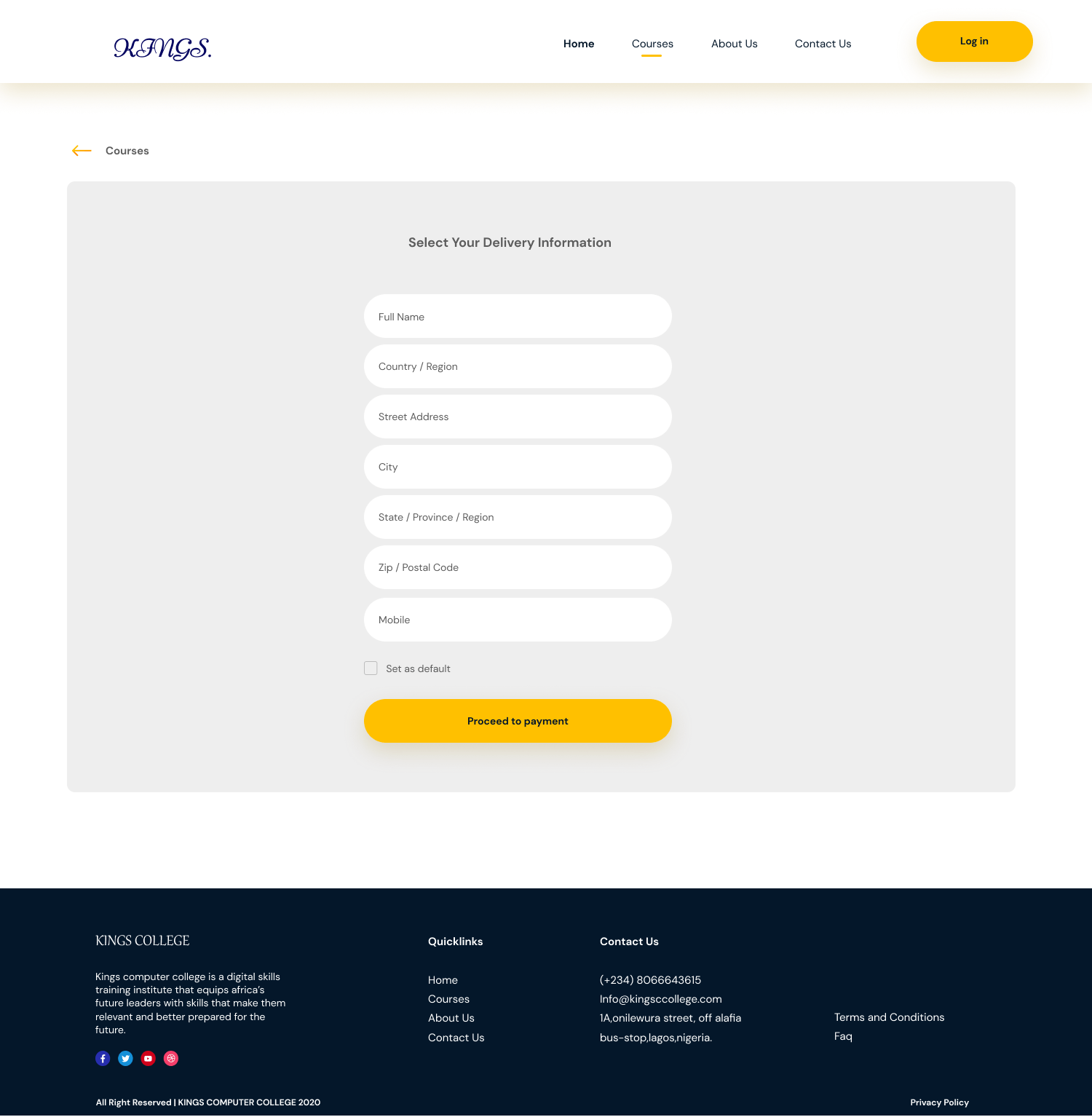
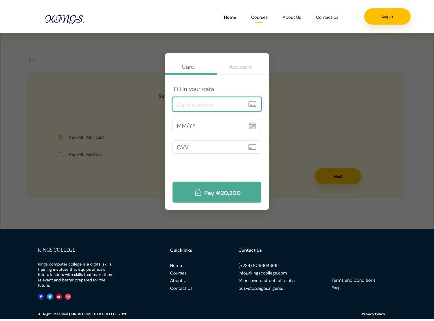
Since most respondents from my initial research preferred installment payments, we provided an option for then;
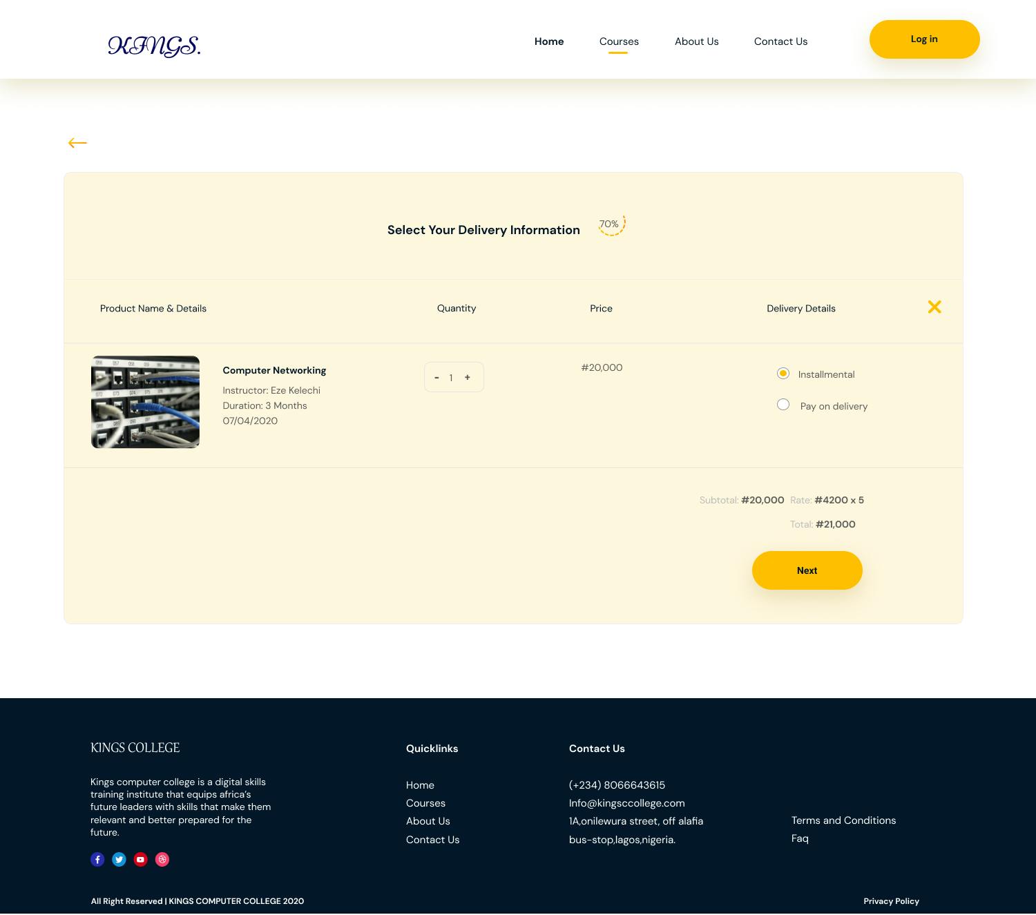
Then they select their preferred payment option;
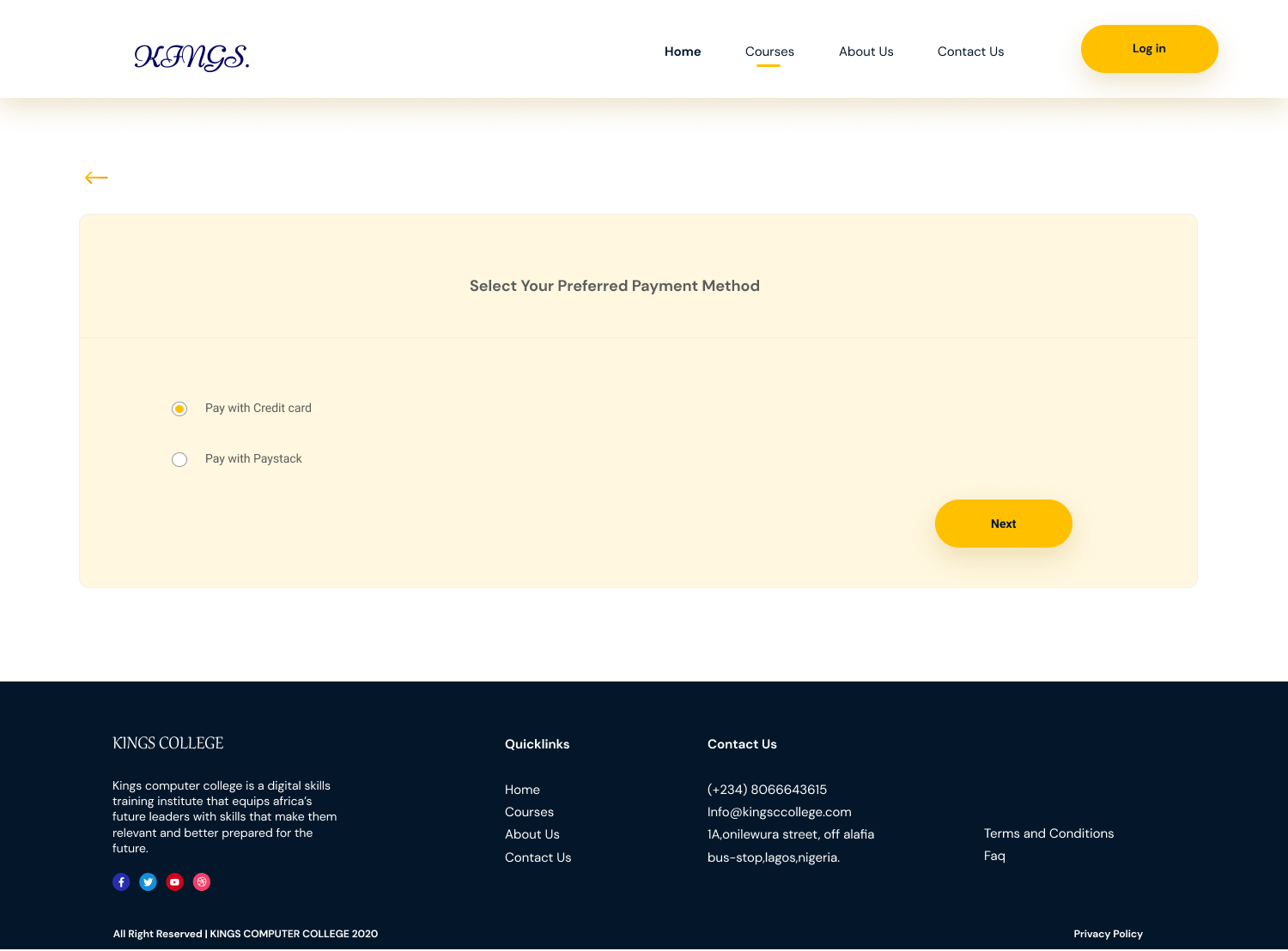
Fill in their card details;
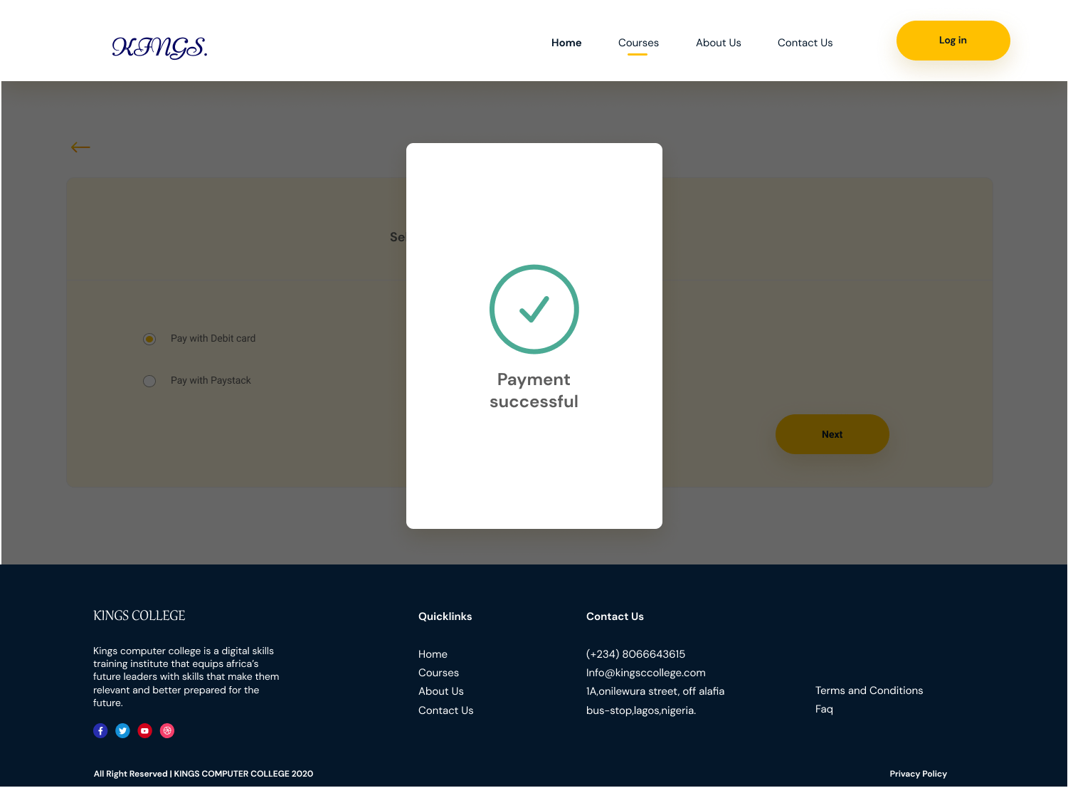
And, voila
Here is the prototype
User testing
Using the Figma prototype, I conducted usability testing with my initial research respondents. Three participants tested the prototype in-person, and one person tested the prototype remotely via screen share.
Test objectives
Evaluate the usability of the website based on five components: learnability, efficiency, memorability, errors, and satisfaction.
Discover how easily the user is able to complete the task flow
Observe the overall satisfaction of the user has when navigating through the prototype.
Uncover any areas of inefficiency, confusion, or difficulty for the user.
Test procedure
For the test procedure, I made sure I made the verbiage intentionally vague.
Imagine your name was Chisom vera and you are a sales rep in search of a competent computer training school, so you can gain competence in the field and change your career. You were then referred to kings computer college
First, visit the website, click on "Courses" from the top nav or CTA, browse through different categories, and select a course.
Next, view course details and click on purchase, then proceed to payment.
Usability testing results
Test completion rate: 100% (4 of 4) of participants were able to complete the tasks.
Error-free rate: 75% (3 of 4) participants were able to complete the tasks without any error. 25% (1 of 4) participants experienced friction with filling in her delivery information, the participant who experienced friction has never made a payment online before, while the other three had an experience.
Summary of findings
Overall. participants said the website was easy to use
making payments was straightforward, but the process could be shortened
The purchase button on the course overview page was confusing and not optimized for conversion.
Next steps
Based on the results of the usability testing, I identified key problems to address in the next iterations of the website.
Test a new prototype and iterate again based on feedback.
Craft a new payment flow
Get a more reliable payment processor
Conduct more usability testing as new updates are implemented.
Project timeline
9 weeks of research and implementation using Figma, pen & paper, and whimsical.
My takeaways
My favorite step:
It’s a tie: user research, which I always love doing, and user testing, which lets me validate my initial assumptions & the effectiveness of my solution.
What I learned:
Like, a lot. Remote usability testing looks daunting but can be simplified through respondents' orientation.
User research provided an essential foundation for design strategy. It helped us create an optimal product for our users.
Concious competence:
The best way I’ve found to quickly, easily, and comprehensively communicate with both my team and my client is to share sketches throughout the whole project. Not only does this help me articulate how I plan to tackle a problem, but by thinking out loud on paper, it allows everyone—myself, my team, and my client—to see how ideas begin, evolve, and finally crystalize into the solution we’ve all been working toward.