


TL;DR
I redesigned the website for one of the leading lights in content production in Nigeria that tells stories through experiential learning utilizing characters that can be resonated with and mirror our reality as Africans.
Since the redesign was unsolicited, I needed to do a deep dive into the business goals it's product offerings, and user needs in order for my work to be relevant and help the business and its target audience achieve their goals.
With those learnings in mind, I laid the groundwork for the website through developing the information architecture and analyzing potential user flows. I then created a low-fi wireframe, conducted user testing, and finally created the user interface design and a style guide to position the company in a way that reflected its values.
The Origin
I first came across a video on twitter
A drone hovering over a balcony carrying a carton of Indomie noodles. Following the command of the person behind the camera, it dropped the carton on a table and brought out a PoS device, seemingly out of nowhere. The person recording then went on to make payment by swiping their card through the PoS. And that was it. No PIN or few seconds of network delay. A simple swipe and the drone glided away.
I did a quick google search of the video and I was not satisfied with my results. The next day I visited my favorite website for African tech stories(techpoint.africa) and fortunately for me, they made media coverage of the video and its creator.
That was how I came across Quadron studios, and out of curiosity, I made more research about their business and their target audience.
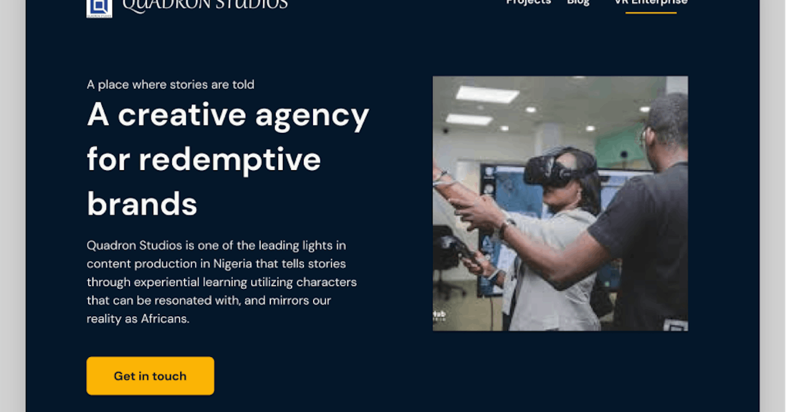
Quadron studios is one of the leading lights in content production in Nigeria that tells stories through experiential learning utilizing characters that can be resonated with and mirror our reality as Africans.
They have a decent portfolio of projects they executed for reputable brands in Nigeria which include;
MTN
ALAT by WEMABANK
GUO transport company
I was really intrigued by the VR enterprise
With VR enterprise they offer a life-scale reproduction of your facility in a virtual world which features training simulations tailored specifically to meet your enterprise's needs.
The challenge
I did an analysis of their website and I discovered the website [quadronstudios.com] was not amplifying the message of the business and my assumptions were validated by all initial respondents in my research.
Design is an investment, not an expense.
Well-designed products have excellent usability, and because usability is a significant contributor to product quality, it elevates the user experience.
My challenge was to craft a delightful experience for the business that will serve its goals and solve the needs of its target customer segment.
Design process
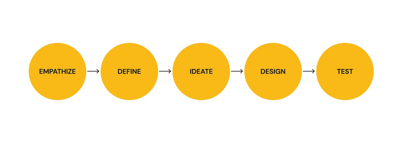
Research
Research goals
Seek first impressions of the existing Quadron website.
uncover Quadron's target customer segment and business goals.
uncover what kind of content will be more meaningful to the website visitors.
uncover the user's preferences & pain points.
Interviews
I am fully aware Quadron operates a B2B model, so when recruiting participants for my interview, I knew I wanted to gain insights from a few aspects of their customer segment. To maximize value, the target participants meet the following criteria;
- Has a valuable business or a trustworthy brand.
- Has ran a marketing campaign or is aware of its value.
Overview of findings
Part 1:Expectations/General thoughts on creative digital campaigns
Participants are willing to pay for campaigns that can help them compel their target customers.
A portfolio of successful projects is the main conversion factor than the price.
Part 2:Impressioons from existing Quadron website
It's unclear exactly what's being sold and the overall vibe feels and looks unprofessional.
The overall flow does not lead to logical places.
The Cta's are not optimized for conversion.
The gallery does not add value and the layout is not descriptive.
The about us page is nice but could be improved with better visuals.
The landing page lacks conversion-optimized copy/content.
Define
Persona
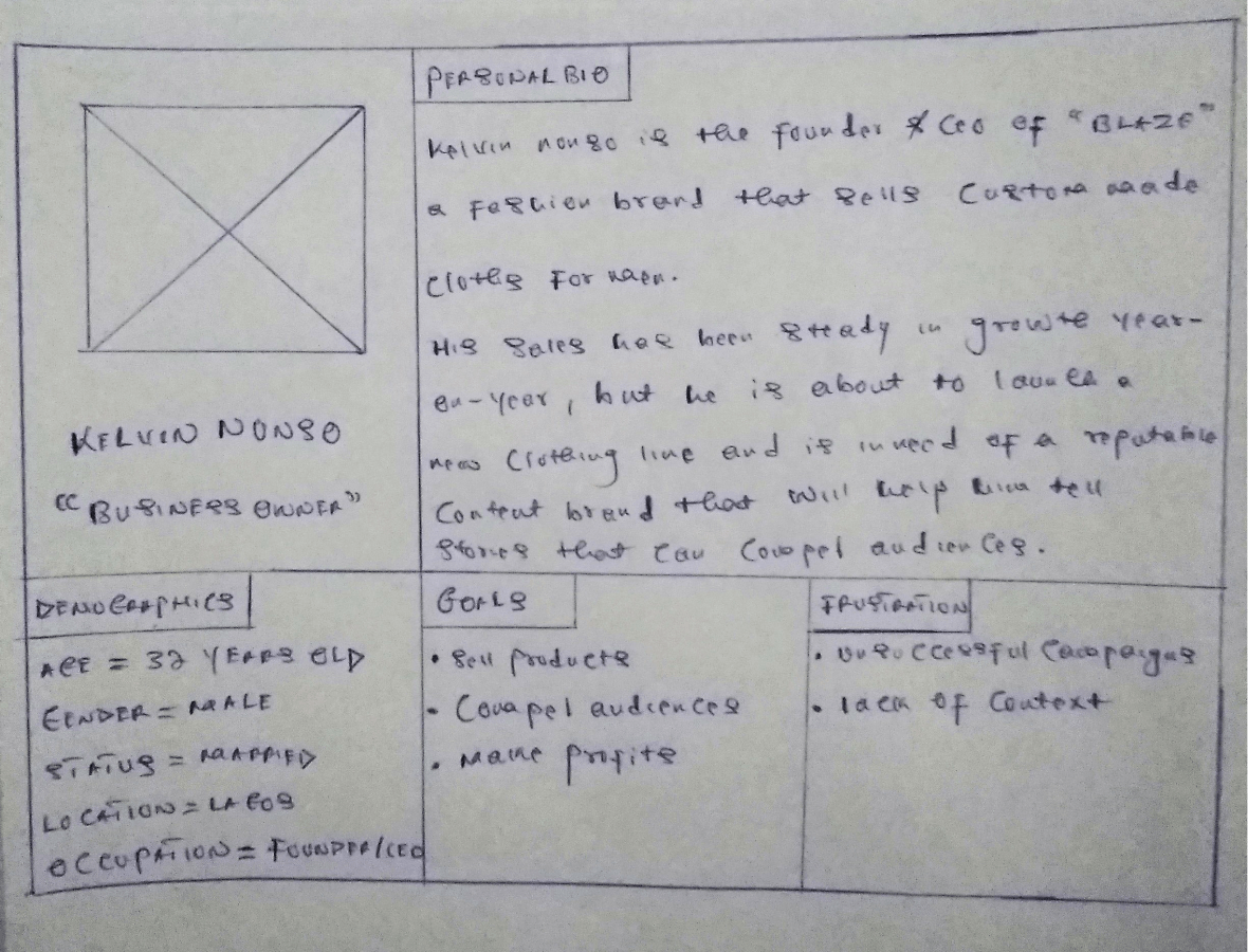
I used the learnings from my research and1;1 interview to craft my ideal persona (a realistic customer of Quadron services)
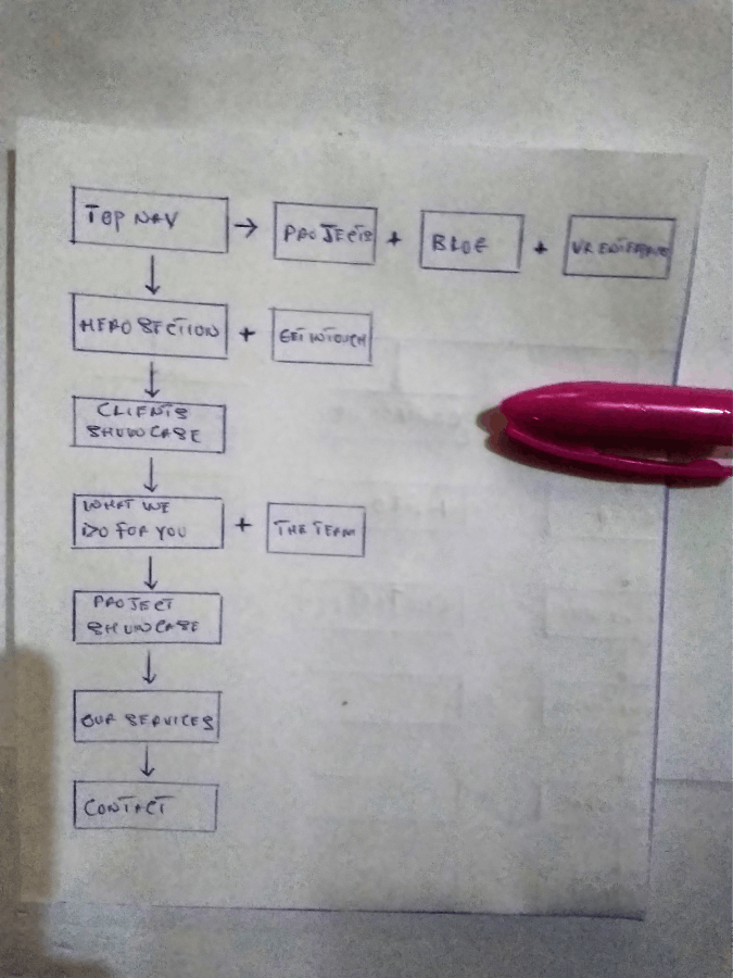
Information architecture
Sitemap
With my user interviews in mind, I created a sitemap for the website. I wanted the information architecture to be minimal and intuitive for its customer segment displaying relevant content and conversion-optimized copy.
Wireframes
Sketching
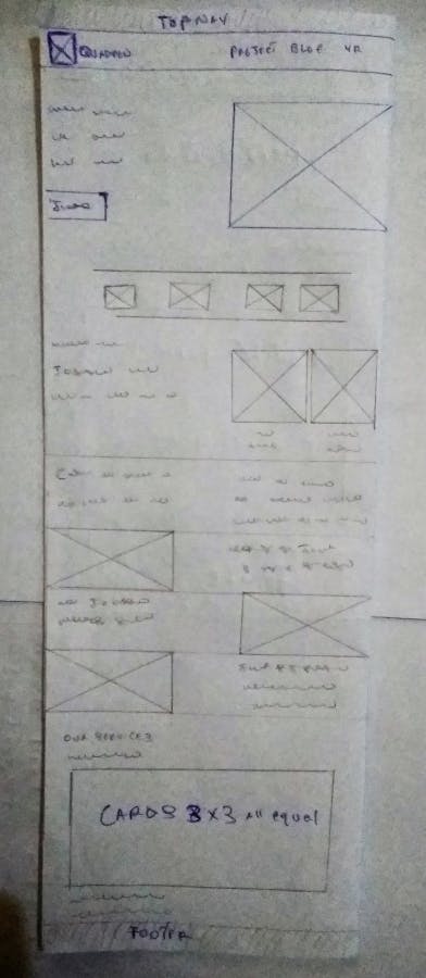
To start the ideation process, I quickly sketched numerous versions of the website, I used my sitemap to help build out the low-fi sketch and kept in mind the users and their logical flow.
Below is the sketch for the landing page;
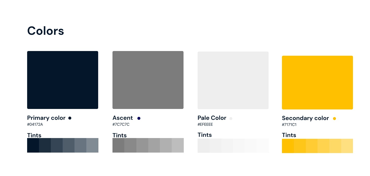
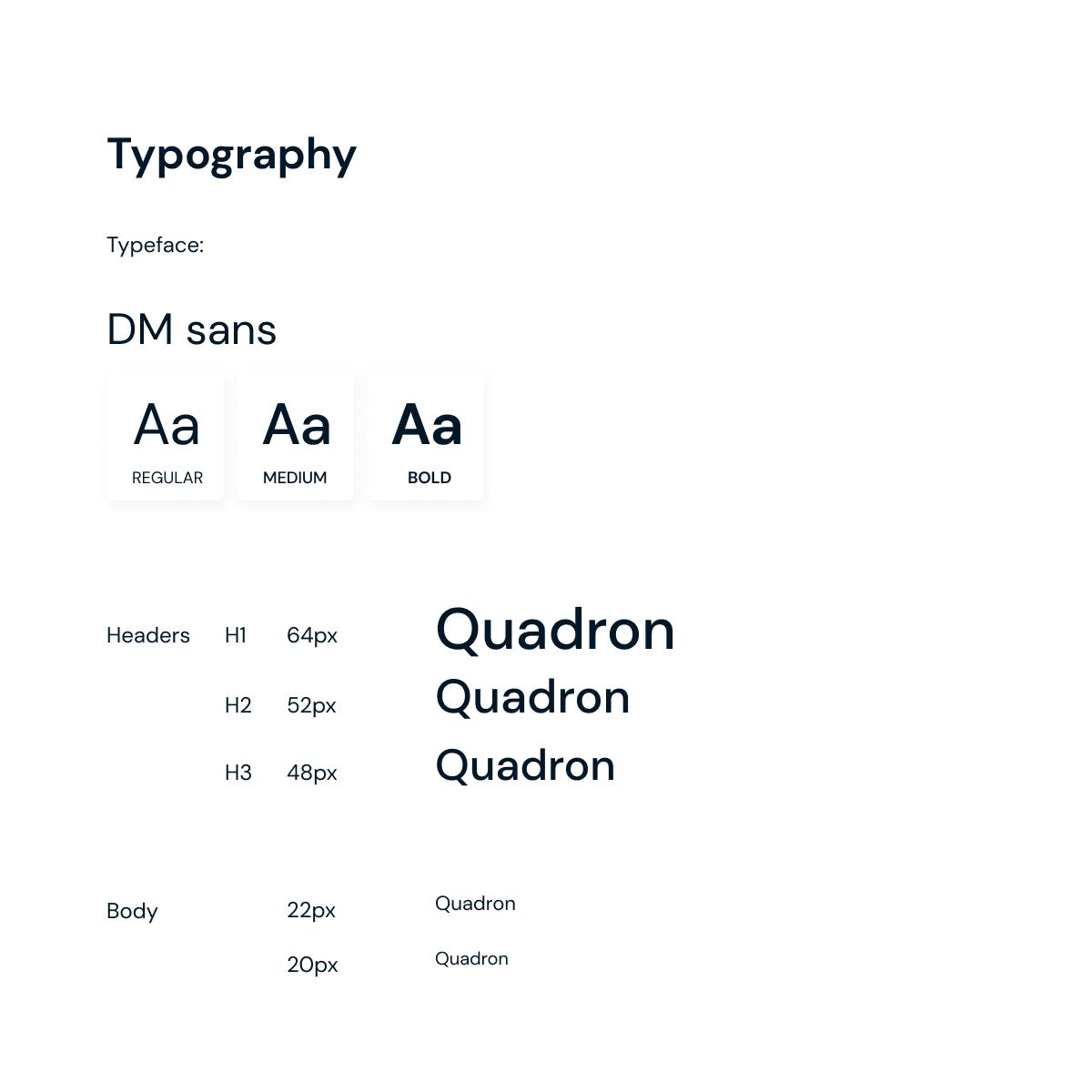
Style guide
When developing the style tile for Quadron, I wanted to develop a bright and cheerful mood so users would feel positive when using the app. Regardless of the type of user accessing the app, they are all focused on crafting an engaging story that can compel their target audience. For this reason, all design choices were all approachable and accessible.
UI design
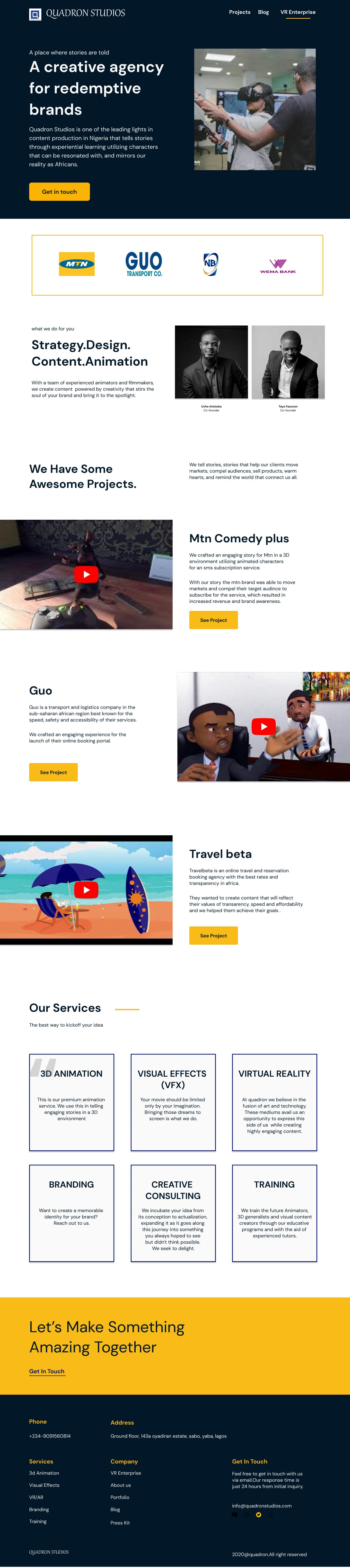
With my low-fi wireframe as a guide, I created a hi-fi redesign of the website in Figma;
Initial Validation
I conducted a rapid validation test with my earlier respondents and discovered that;
The website became easier to use; as it's easier for users to see what they want to do at first glance.
The UI looks more appealing to the eyes of the users.
The redesigned website is better optimized for conversions even in its minimal state.
Generally, my initial respondents loved the end results.
Project timeline
4 weeks of research and implementation using Figma, pen & paper, and whimsical.
My takeaways
My favorite step:
It’s a tie: user interviews, which I always love doing, and sitemapping, which lets me stretch my product thinking muscles.
What I learned:
Like, a lot. More isn’t necessarily more when it comes to landing-page CTAs. Benefits don’t sell on their own – you need the context that feature-descriptions provide.
Reflections:
Personally, I am not a fan of unsolicited redesign efforts that I see around the web. The reason is most of these designs are solving problems that do not exist. With few exceptions, the redesigns are mostly focused on the visual look of the product with zero consideration to the product’s existing branding and address no issues of usability.
So when I decided to take up this challenge I knew exactly what not to do.
There is no doubt that the team behind Quadron spent countless hours to make what we see now. They conducted a lot of researches and iterations. They have access to a huge amount of data which tells them how the users behave and what they try to accomplish. The features and how they have been laid out must have the reasoning driven by those research and data. Besides, the company has its own agenda and goals to achieve.
The amount of research that has been done by me within a limited period of time is fairly small compared to what the Quadron team did.
So I don’t claim that every decision I have taken to redesign the website is better than what exists now. I absolutely think a lot more research, usability testing, and iterations can be done to improve the Quadron experience; after all, design is a continuous process!