TL;DR
I designed a modern, responsive website for an agritech startup from the ground up. Since I was planning on entering a new market, I needed to do a deep-dive into the industry landscape, my startup's potential competitors, and conduct interviews with users in the target demographic to understand the pain points and needs of potential customers.
With those learnings in mind, I laid the groundwork for the website through developing the information architecture and analyzing potential user flows. I then created wireframes, rapid prototypes, conducted user testing, and finally created the user interface design and branding elements to position the company in a way that reflected its values.
Challenge
Smallholder farmers don't have the machinery they need to fully cultivate their land.
Tractors and farm equipment are expensive and financing is virtually nonexistent
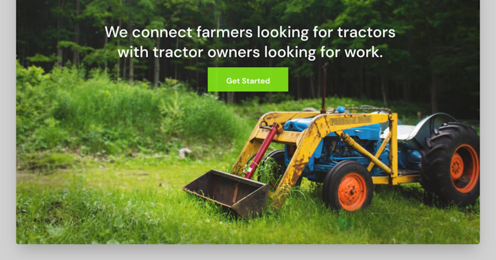
To address tractor availability, we came up with a platform that connects farmers looking for tractors and tractor owners looking for work.
My challenge was to create a responsive website with seamless navigation that makes it easier and less risky for tractor owners to run their business while connecting farmers to machinery that lets them produce enough food to feed their families and sustain their livelihood.
An additional challenge was to craft a seamless flow for youths to sign up as booking agents who will be trained to assist farmers to overcome technology gaps and ensure idle tractors are matched to farmers.
Design process
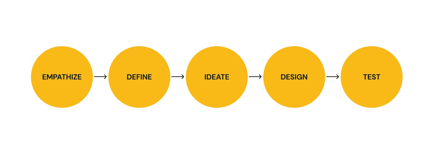
Research
Research goals:
Discover industry best practices
Uncover tractor owners' fears and frustrations in renting tractors.
Uncover farmer’s biggest motivations for hiring tractors and farm equipment.
Discover how best to involve youths in the value chain and empower them with sustainable livelihoods.
Competitive Analysis
In this phase, I analyzed what two tech companies in west Africa were doing to serve Africa's food insecure population.
It was interesting to analyze the difference between companies when it came to their messaging about mechanized farming. (insert the logo of hello tractor and trotrotractor)
Takeaways
Hello Tractor is an award-winning diversified ag-tech company focused on improving food and income security throughout sub-Saharan Africa.
Hello Tractor facilitates convenient and affordable tractor services to these farmers while providing additional income by turning tractors into Smart Tractors.
Trotro tractor is a Ghanian ag-tech startup that offers tractor and farm mechanization tools for farmers, they mostly operate with a group of farmers(cooperative unions) in order to deploy tractors to large acres of land thereby increasing efficiency.
1.1 Interviews
When recruiting participants for my 1:1 interviews, I knew I wanted to gain insight on each aspect of the tractor hauling process including requesting a tractor, inspecting a land(due diligence), and deploying a tractor. I interviewed individuals who touched on the various aspects of the farm mechanization process.
Overview of findings
The main motivation for fleet owners is to get clients
Most fleet owners were willing to pay money to anyone agents and companies that can connect them to farmers in need of their services.
A common source of fear for fleet owners is the issue of unreliable agents who perform fraudulent acts.
The most prevalent frustration fleet owners have is that most farmers or tractor operators mishandle their fleets and are not willing to pay for damages.
A solid guarantee of the safety of their fleets is the real deal-breaker.
For the due diligence, both ends preferred well-vetted agents who will inspect the land of the farmer
Most farmers were satisfied with the availability of field agents (but farmers have a track record of bribery, where they entice the agents to report adulterated figures to the fleet owner)
Another concern is the technology bias among farmers and in my findings, the availability of field agents that will help farmers overcome this hurdle is a must, as fleet owners are too busy for this.
Farmers are also tired of the much paperwork involved in the process and are willing to opt for an alternative.
Define
Personas
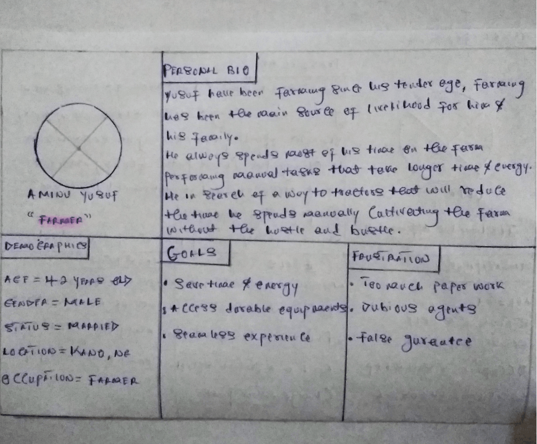
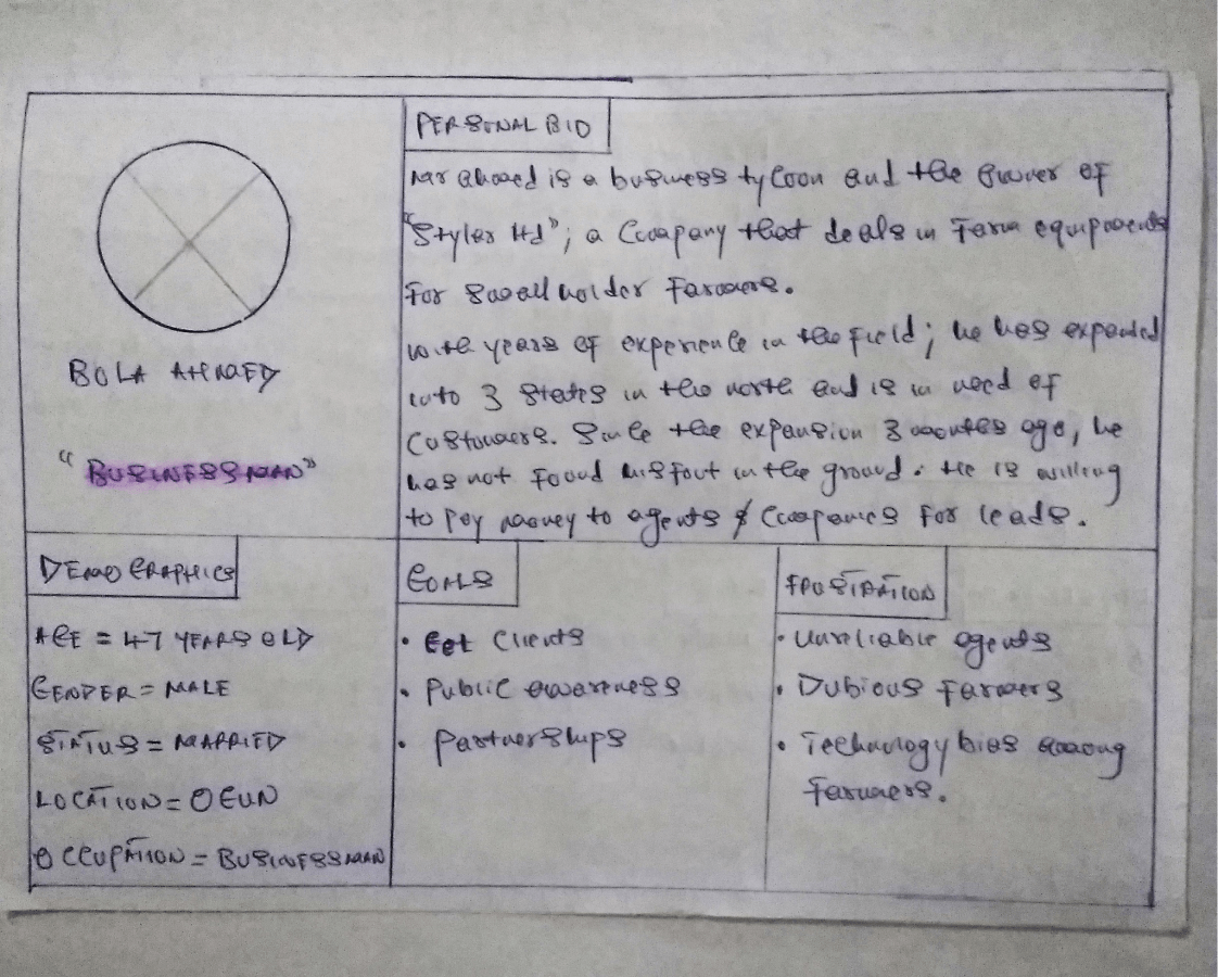
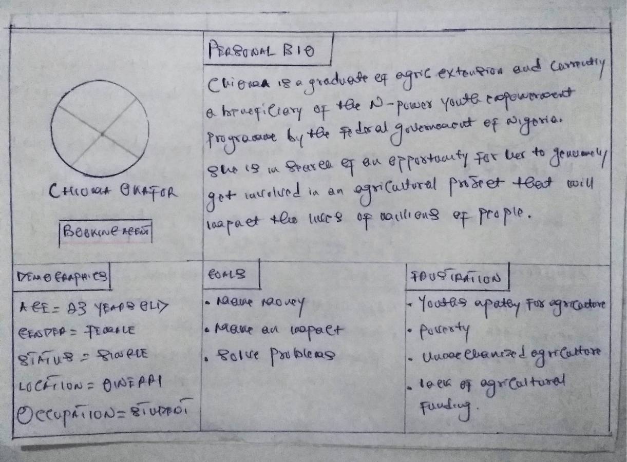
I used the learnings from my research, market analysis, and interviews to inform my ideal persona. Since there would be three distinct users for the app (fleet owners, booking agents, farmers) with different pain points and motivations, I developed three distinct personas.
My first persona, Aminu Yusuf, represents the ideal farmer. From my interviews, I learned that while they are in need of tractors that can help them cut down the time they spend manually cultivating the farm they are being plagued with a lot of paperwork by traditional fleet owners and are in search of an alternative.
My second persona, bola Ahmed, represents the ideal fleet owner. He is a business tycoon and wants to expand in a different location but needs a constant inflow of clients and is in search of agencies and agents that can help him, onboard farmers.
My third persona is a recent graduate who wants to impact his environment and is aware of the advantages of farm mechanization.
Information Architecture
Sitemap
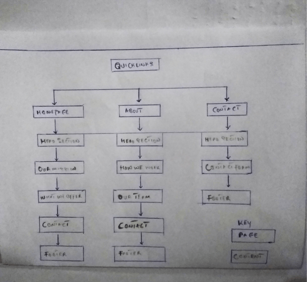
Using the reviewed sites as an example with my user interviews in mind, I created a sitemap.
Wireframes
Sketching
To start the ideation process, I quickly sketched numerous versions of the website, I used my sitemap to help build out the low-fi sketch and kept in mind the users.
Below are the sketches;
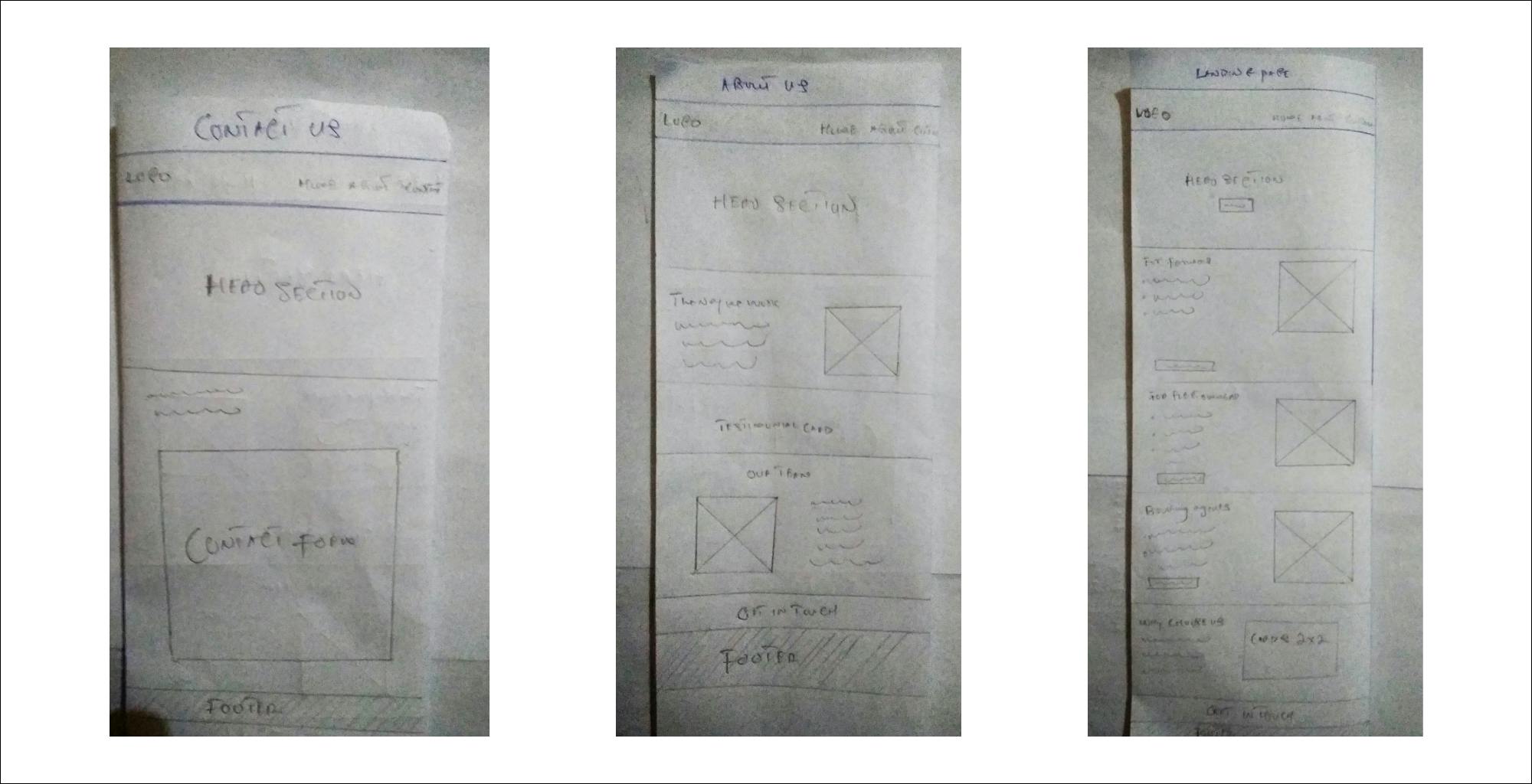
NB; The mid-fi wireframes are concealed under a non-disclosure agreement(NDA)
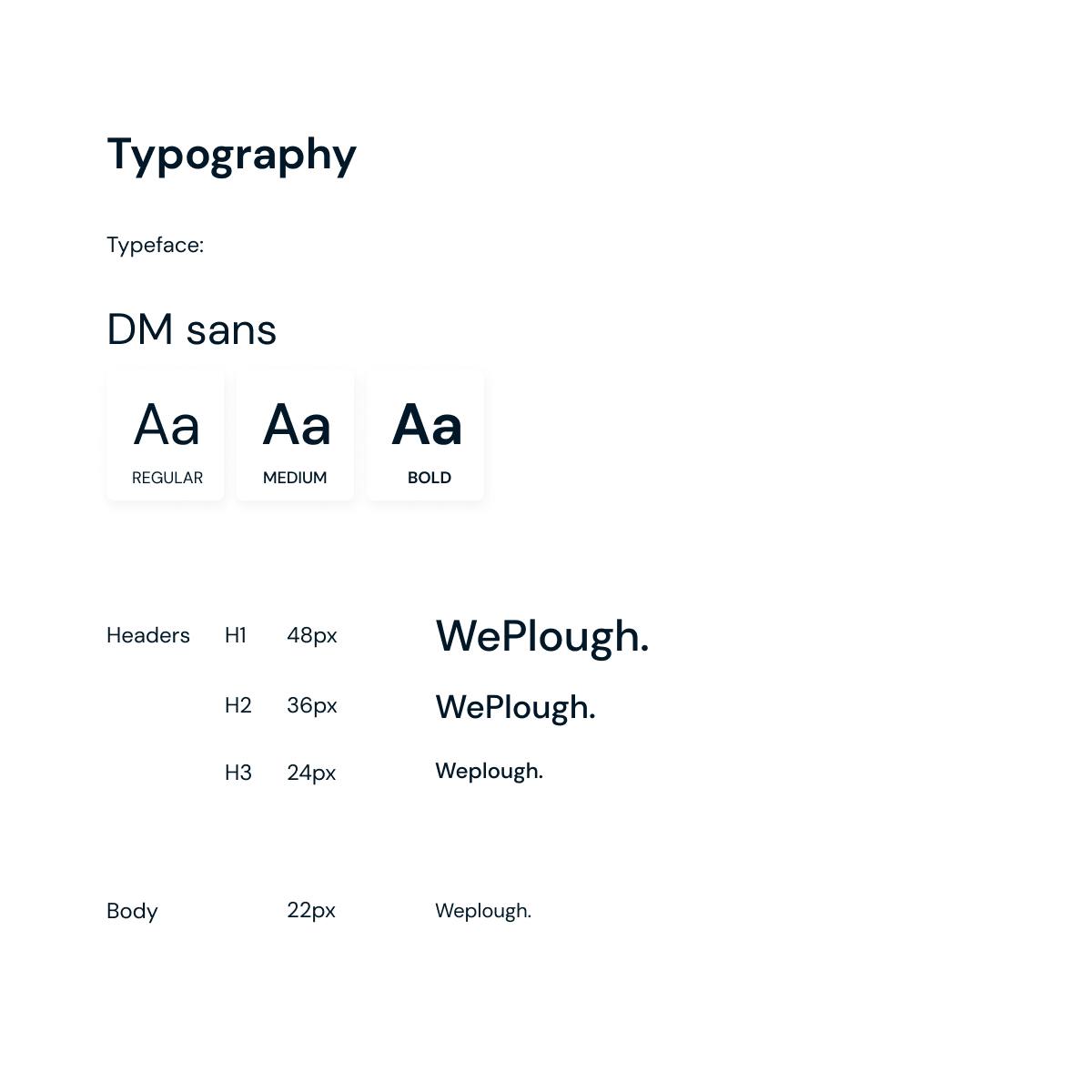
Style guide
UI design
With my low-fi wireframe as a guide, I created a hi-fi design of the website in Figma;
Landing page

contact us

about us
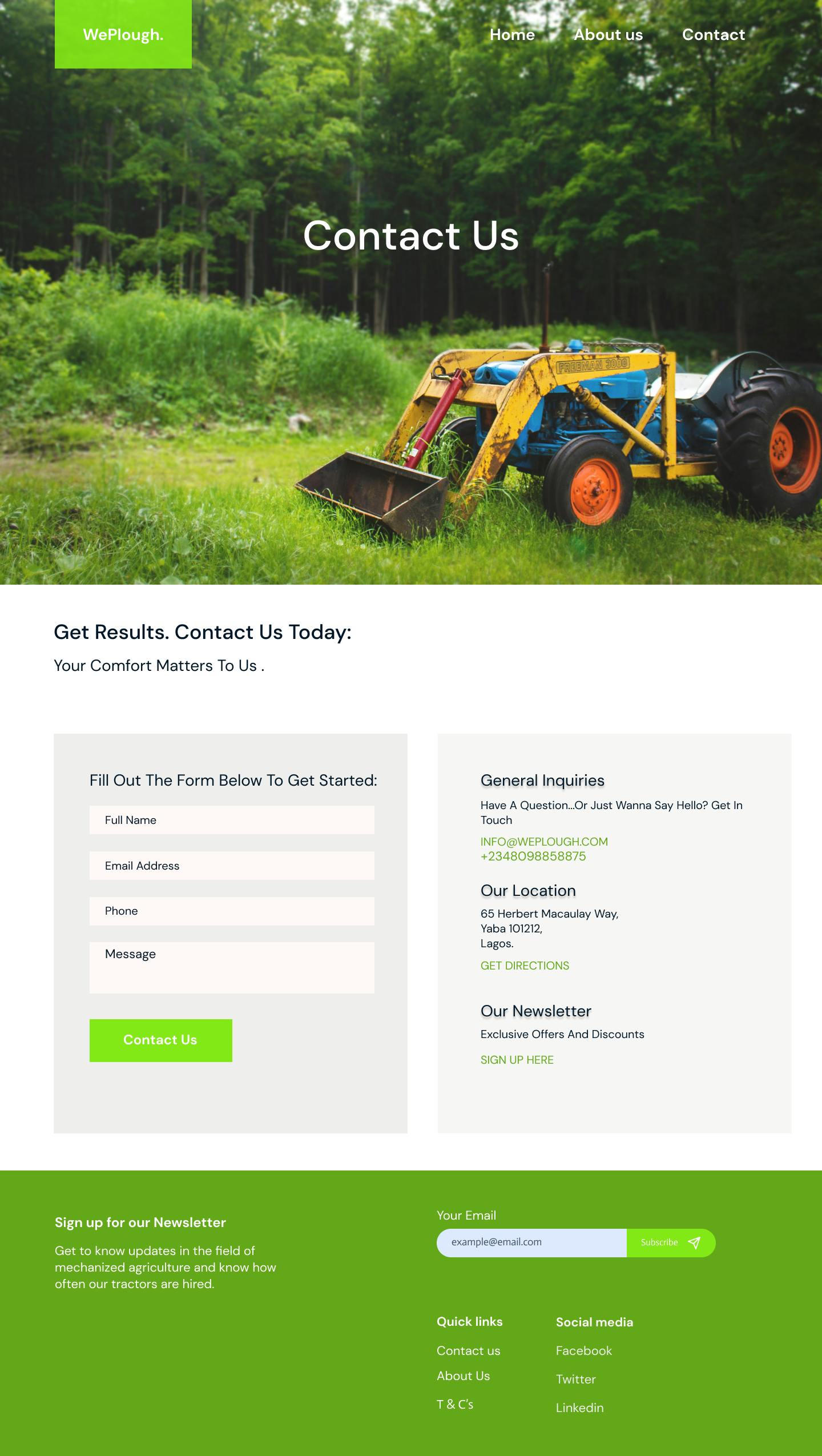
This is just the first iteration and a snapshot of the designs, since the product is still in prelaunch, the next iterations of the design will be released.
Most specifics in this project are under NDA
User testing
This section is covered under a non-disclosure agreement
Next steps
Based on the results of the usability testing, I identified key problems to address in the next iterations of the website.
Test a new prototype and iterate again based on feedback.
Design the full mobile app
Deploy a ussd feature with my cofounder
Conduct more usability testing as new updates are implemented.
Project timeline
8 weeks of initial on-site research, 4 weeks of design, and months of continuous implementation & iteration using Figma, miro, pen & paper, and whimsical.
My takeaways
Conscious competence :
1. Why I choose paper sketch over digital mapping
The best way I’ve found to quickly, easily, and comprehensively communicate with both my team and my client is to share sketches throughout the whole project. Not only does this help me articulate how I plan to tackle a problem, but by thinking out loud on paper, it allows everyone—myself, my team, and my client—to see how ideas begin, evolve, and finally crystalize into the solution we’ve all been working toward.
Sketching can be a braindump of anything that may come to mind—don’t make it perfect, leave room for interpretation. Imperfections and misinterpretations can lead to new ideas and sometimes the out of the box ideas are the best paths to the right solutions. The freedom of moving your pen around on paper works hand in hand with exercising the mind and sparking new ideas.
Filtering can come later.
These days, technology has taken over, and trust me I am a proponent with my Macbook, iPhone, and design tools—but taking pen to paper offers benefits that just can’t be substituted.
2. Why we spent more time on user research
User research provided an essential foundation for design strategy. It helped us create an optimal product for our users.
Most importantly, we have the data to back our strategy and design decisions.
User research also helped us identify early adopters who would use our product.
Operational influence :
Design, for better for worse, has a longstanding history of not having a voice or a seat at the table.
But in this project, I added value in my interaction with my team members in a way that moved the team forward.
- At some point in the project, I discovered we had different versions of our USP(unique selling point) in our heads.so I organized discovery and alignment sessions so we could align our disparate ideas.
- Our engineer wanted to add sexy features that were not aligned to the user's goal - I walked him through a typical user journey anchored in the research we had done and after putting himself in the user's shoes he realized it wasn't the right move.
Retrospestive :
- I am now fully convinced that experience in design implementation is a big way to develop developer empathy. This has been my mistake in the past and I've learned how to step my foot in the developer's shoes and make his work easier.
NDA
This case study is protected by an NDA and it excludes sensitive information such as; exact growth metrics, secret techniques or tools used, user flow, full onboarding process, major screens, user testing results.
This project is still in beta and is important to me and my partner and I am willing to go to great trouble to honor the NDA.
Although NDA’s are considered to be a hindrance in the eyes of designers, it is important to understand that they are vital in cementing a trustworthy relationship between me and my client.
We as designers are well aware of protecting our intellectual property, so it is only right that we respect our client’s wishes too.

